Data Health Dashboard
What Is the Data Health Dashboard
The Data Health Dashboard aims to solve two critical use cases:
- Triaging Data Quality Issues
- Understanding Broader Data Quality Coverage and Trends
You can access it via the Sidebar Nav. It can be found under the Observe section.
How to use it
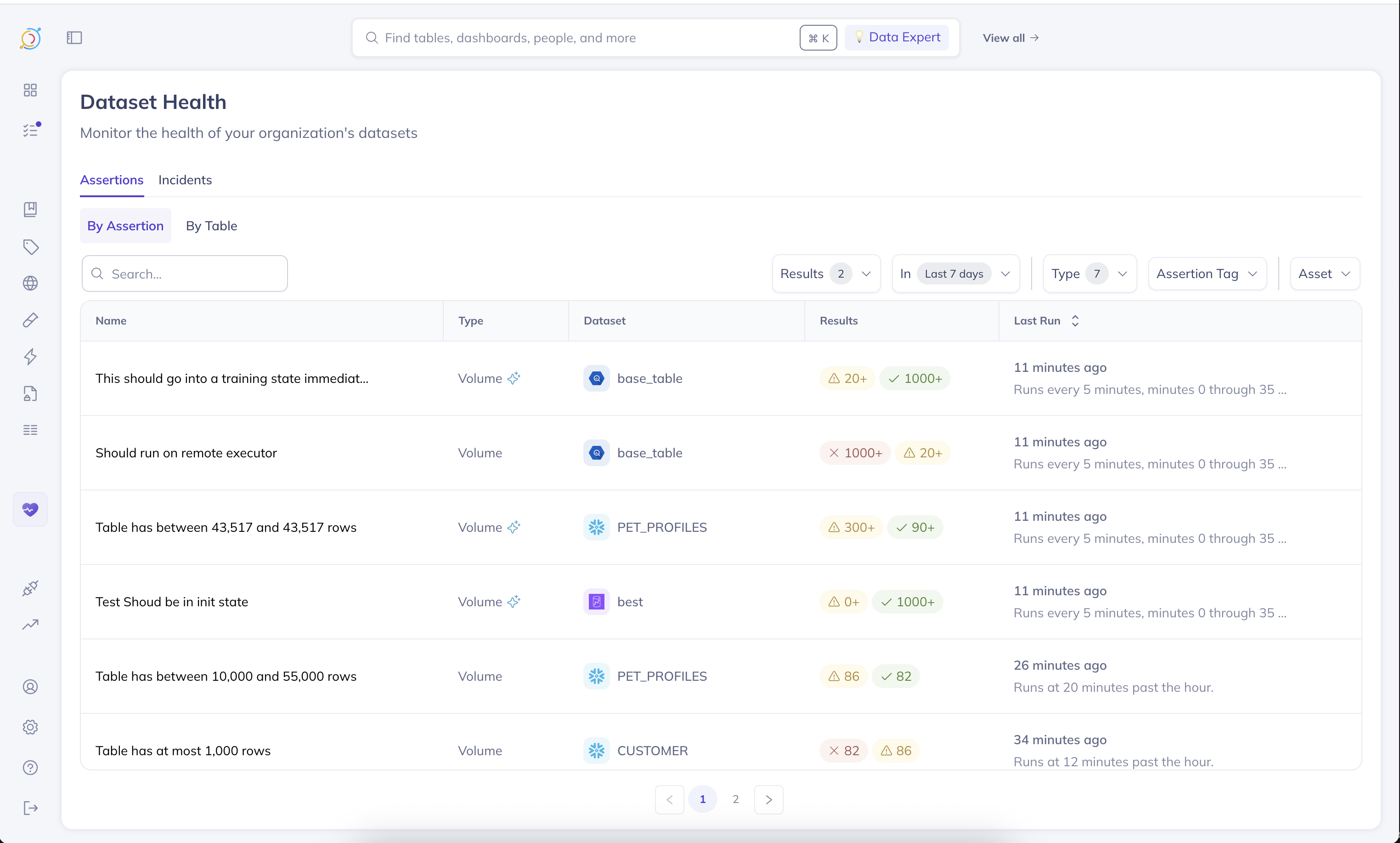
Assertions Tab
There are two ways to slice assertions:
- By Assertion
- By Table
When to use By Assertion
This view presents an activity log of assertion runs, sorted by the last time a given assertion ran. This is incredibly valuable for triaging and detecting trends in the data quality checks.
For instance, by applying a time range filter (i.e., Last 7 Days), and setting Results to At least one failure, you can quickly see which assertions have failed at least once in the last 7 days. Furthermore, you'll be able to see how often their failing, relative to how often they're running, enabling you to quickly find and investigate flaky checks.
When to use By Table
This view presents a list of tables that have at least one assertion that has ran on it. It is sorted by the last time any assertion ran on that table. The health dots indicate the last status of an assertion of that given type on the table.
This view is incredibly useful for understanding monitoring coverage across your team's tables.
Incidents Tab
The incidents tab presents the tables that have active incidents open against them. It is sorted by the last time an incident activity was reported on the given table.
At a glance, you can grasp how many incidents are open against any given table, see which incident last had updates on that table, and who owns it.
Coming soon: In the future we'll be introducing high-level visual cards giving useful statistics on table coverage, time to resolution, and more. We will also be introducing a timeline view of assertion failures over a given time period. Our hope is to make it even easier to detect trends in data quality failures at a single glance.
Personalizing the Dashboard
We understand that each team, and perhaps even an individual may care about a different subset of data than others. For this reason, we have included a broad range of filters to make it easy to drill down the Dashboard to the specific subset of data you care about. You can filter by:
- Dataset Owner
- Dataset Domain
- Dataset Tags ...and much more.
In addition, both the By Tables tab and the Incidents tab will apply your global View (managed via the search bar on the very top of DataHub's navigation). So if you already have a view created for your team, these tabs will automatically filter the reports down to the subset of data only you care about.
Data Observability Agent (Private Beta)
The Data Observability Agent is an AI assistant embedded directly in the Data Health Dashboard. It helps you go from "I have a lot of tables and not enough monitors" to "the right checks are in place, and I know where to focus first" — without leaving the dashboard.
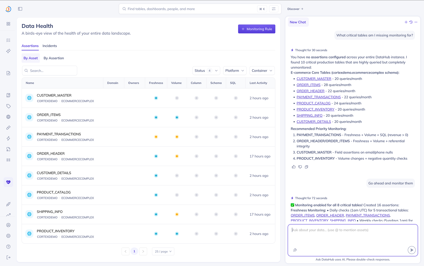
What it can help with
1. Setting up anomaly detection and data quality checks
Tell the agent what slice of your data landscape you care most about — or let it figure out what's most important for you — and it will recommend and create the right assertions:
- Freshness — for tables on a regular refresh cadence
- Volume — for tables with expected row counts or growth rates
- Field — column-level quality (null checks, format validation, statistical monitoring)
- ...and more
The agent picks an appropriate source type automatically based on whether the dataset has an active platform connection or only DataHub metadata, and creates assertions in active mode so they start running immediately.
2. Identifying where to focus
The agent can scan your assertion landscape to surface what matters most — recent assertion failures that are most concerning, tables that lack monitoring coverage, flaky checks worth investigating, and broader trends across your domain or team's tables. Use it to triage Data Health at the start of the day or after an incident.
Example questions to ask
- "Set up anomaly detection for my datasets"
- "What critical tables am I missing monitoring for?"
- "Give me a health report across my datasets"
- "Which assertions failed in the last 7 days?"
- "Add a freshness check on
prod.analytics.orders— it should land daily by 6am UTC"
Access
The Data Observability Agent is currently in private beta. Reach out to your DataHub representative to enable it for your instance.
Monitoring Rules
Monitoring Rules are currently in Public Beta — available to all DataHub Cloud customers; we welcome feedback as we continue to iterate.
Monitoring Rules let you apply assertions across your data landscape using search-based predicates. Instead of manually creating assertions on individual tables, you define a rule that describes which datasets should be monitored and what to monitor, and DataHub takes care of the rest.
For Freshness and Volume, Monitoring Rules create Anomaly Detection monitors on matching datasets. For Schema, they create standard Schema assertions on matching datasets.
Prerequisites
To create and manage Monitoring Rules, you must have the Manage Tests platform privilege. Contact your DataHub admin if you do not have this privilege.
How It Works
- Define a search predicate — specify the datasets you want to monitor using filters such as DataHub Domain, data platform, schema, tags, or any combination of search criteria.
- Choose assertion types — enable one or more of Freshness Anomaly Detection, Volume Anomaly Detection, and Schema assertions for matching datasets.
- Configure subscriptions — set up alert subscriptions so you or your team are notified when issues are detected.
- Save the rule — DataHub will automatically create the corresponding assertions on all datasets that currently match the predicate.
You can create and manage Monitoring Rules from the Data Health Dashboard by clicking the Monitoring Rules button.
Automatic Lifecycle Management
Monitoring Rules are continuously evaluated as your data landscape evolves:
- New datasets that match the predicate will automatically have assertions created for them.
- Datasets that no longer match the predicate will have their rule-created assertions stopped and removed.
- Stopping a rule will stop all assertions that were created by that rule.
Subscriptions created by a Monitoring Rule are not removed when a dataset stops matching the predicate or when the rule is stopped. This ensures you retain visibility into any in-flight alerts or ongoing incidents even after the monitoring scope changes. You can manage subscriptions independently if needed.